
Harvest Moon
Backstory
Last year, in September, I went back to traditional art. The need to use something other than my Cintiq stemmed from a sudden feeling of alienation from digital softwares.
New AI technologies can be overwhelming and their main ‘creative’ use is more than a little disappointing, but I didn’t want these changes to affect me negatively. In fact, these changes prompted me to look elsewhere to stay connected with my passion, and I didn’t have to look far. I simply opened an abandoned drawer filled with tools and media I hadn’t used in over ten years (yes, it’s embarrassing).
I wanted to return to the feeling of holding a pencil, hearing its soft scratch on paper, and I just wanted to prove to myself that I don’t need to rely on digital tools, but only on my creativity, and that I can be patient and work for days, or weeks, on a piece without going mad (vs the hours it takes to render an illustration in Photoshop, vs the few minutes it takes to generate an AI image).
Basically, I rediscovered the value of time.
To the point
Last September, I experimented with some new media I’d never used before, like gouache and alcohol markers. I had a lot of fun with the latter because their use is an exercise in working extra fast to better blend colours, and the result reminds me of watercolours (a medium that, to be honest, I never liked until only recently).
Markers and coloured pencils are my new favourite combination.
After some failed attempts, I decided to render a few old ideas. I used old sketches from my ‘for later’ folder and traced them on paper.
The first piece that I don’t consider a failure is this one.

Fall and Frost, Copic markers and coloured pencils on paper.
In this piece, I went for a stylised, more aesthetic look to design the character, narrowing their facial proportions and elongating the eyes. I was inspired by old Japanese and Indian paintings in particular.
I’m also quite happy with how I managed to render the light in this one, all thanks to a matte medium. More on that later.
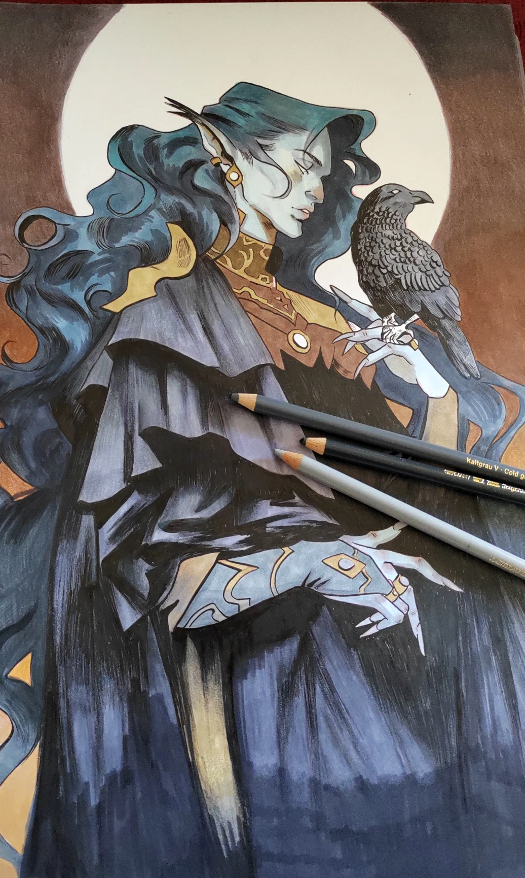
Harvest Moon
My second piece was inspired by the fall, again, and the idea of an entity with sharp features, and a crow as their familiar. It’s another old sketch I found in my ‘for later’ folder.
This time I went for darker and warmer colours. What I learned from the first illustration was that I prefer to work with greys first and add colours later, gradually. I use this exact same glazing technique with gouache and acrylics: painting with thin layers of colour that allow the underdrawing, and my original guiding marks and shadows, to show through. It’s a slow process and requires a lot of patience, but I love it.
Materials:
Huion light pad
Ohuhu A3 paper, 200g
Mechanical pencil
Red pencil
Pigma Micron pens
Pentel Brush Sign pens
Copic markers
Ohuhu markers
Polychromos pencils
Luminance pencils
Acrylic markers
Airbrush
Liquitex Matte Medium
Maimeri Fixative Spray

1. Because I have an A4 printer and work with A3 sheets of paper, I divide the sketch in two parts, print them out, and assemble them to trace the drawing with a light pad, or tracing light box (A4, Huion), onto the paper.
I’m quite messy when it comes to tracing, I always add more marks like shadows for fear of forgetting where they’re supposed to be, even when I literally have the sketch on the screen in front of me!
2. Once I’ve finished tracing the drawing, I use the kneaded eraser to lighten the sketch, gently pressing it onto the paper to pick up the graphite rather than wiping it across, and then go over the drawing again with the cheapest red pencil I have. I go over the lineart and start rendering the shadows. I use cheap pencils for the underdrawing because they are less saturated and contain very little pigment. At such early stages, I don’t want to use heavy media since they would damage a surface specifically meant for markers.

3. After finishing the underdrawing, I deviate from the original plan and render my undertones mostly useless by adding black ink.
Ink is a last minute decision, which I regret halfway down the process, but I’m quite happy with it in the end because I think it adds some much needed contrast. Sometimes you have to follow your instincts! I use the Microns for the finer details and the Pentel pen for the hatching and the wider areas. The Pentel has a brush nib that creates a nice texture, so I immensely enjoy using it.
Once the inking is done, I seal the drawing with a workable fixative spray. Although ink dries fast, I don’t want the markers, which are very wet, especially the Copics, to smudge and dirty the paper in any way.

4. Now begins the colouring process. I start with the background, using warm and saturated colours, and then I choose different greys to colour the character. The skintone looks light blue but it’s a cold grey. My first colours are always more transparent, less saturated; knowing that I’ll be working in layers, I don’t have to go for the ‘heavy’ tones and make important decisions right away.

5. Once I have a first layer of markers, I alternate between them and the Polychromos, using mostly greys and muted colours. The Polychromos are oil-based pencils, so they layer thinly by nature, making them the perfect medium for glazes.
I almost never use markers over pencils. Because pencils create a layer onto the paper surface, the ink of a marker can’t penetrate the paper, and merely floats on top of the pigment. Also, when applied, the marker looks thinner, more transparent than it would normally layer, and this may aid or not to my technique. Sometimes it does, if I want to glaze over a light layer of pencils to add a little colour, but mostly it doesn’t. Pencils also tend to stain (but not damage, as far as I can tell) the brush nibs and that bothers me.
I’m not precious with the rendering when using markers at this stage because I know I’ll go over everything with pencils later.

6. Once it’s time to add more colours and warm tones, I need to seal the illustration with a matte medium. There are different reasons why I do this.
Normal paper can only handle so much colour. Marker paper may handle even less, since it’s a very smooth surface meant for the blendablity of alcohol markers – but I must say that the Ohuhu paper withstood the test and took quite a beating. I added at least four layers of colour before the paper completely lost its tooth.
Matte medium is a very versatile tool. I use it with acrylics and acryla gouache to thin the paint, but it also helps when you want to seal your existing layers of colour with a matte finish, or just need to give the paper tooth for additional colour layers.
To apply the matte medium, I use a cheap airbrush. I fill it with a solution of about 65% distilled water and 35% medium, minding that it’s liquid enough since it acts like glue and, if too thick, it may clog the airbrush.
I apply this medium a total of three times throughout the drawing process (and three times I carefully clean the airbrush, which is the most delicate tool I’m using).
Once the paper is dry, I continue rendering the illustration and add warmer shadows and more details. I also go over my blacks again to deepen the shadows of the outfit. In these final stages I finally use the Luminance pencils as well. Because they’re wax-based, they don’t layer too well and I normally use them on top of the Polychromos. On the other hand, they’re very saturated and pigmented, so they’re perfect to deepen shadows and add even more colour.

7. Satisfied with the overall rendering, I use gold and white acrylic markers to highlight some details of the outfit and add the stars in the sky.
Finally, I seal the piece with fixative spray, let it dry, and scan it!

If you’ve reached the end of the post, thank you so much for reading!